
Alphabet cookie stamp STL files: custom letter stamps in any font
2026-08-15
An alphabet cookie stamp STL set is the thing I reach for most on my bench. One printed tile per letter, a rail to hold them in order, and any name you like pressed into dough or fondant in a single go. I have printed a lot of these, in a lot of fonts, and this is what I have learnt.
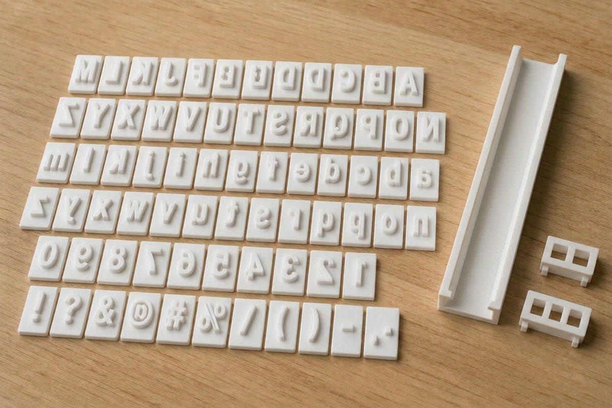
What is an alphabet cookie stamp?
It is a set of small printed tiles, each carrying one raised mirrored letter. You press a tile into rolled dough or a fondant plaque and the letter comes out debossed the right way round. People call them letter stamps, or a fondant letter embosser when they are used on fondant rather than raw biscuit dough. Same tiles either way.
Because the letters are separate, you are not stuck with whatever words someone else decided to sell. You spell what the job needs — a kid's name for a birthday, a couple's initials, the word THANKS across a tray of shortbread. That is the whole appeal of personalised cookies: the tooling changes with the order instead of the order changing to suit the tooling.
The tiles themselves are simple parts: a flat back, a shallow border, and the letter standing proud of the face by a millimetre or so. That shallow relief is deliberate. A deep letter presses a trench that closes up as dough relaxes, while a shallow one leaves a crisp shadow line that survives the oven.
Individual letter tiles vs fixed word stamps
A fixed word stamp is one solid part with the text built in. It is quick, it is rigid, and every impression is identical. If you press the same words over and over — a business name, a logo, "handmade" on the back of everything — a fixed stamp is genuinely the better tool and I would print one for that.
The trouble starts the moment the text changes. A new name means a new part, a new print, and another thing in the drawer. Letter cookie stamps solve that with interchangeable tiles: one set covers every word you will ever need, and if you drop an E on the tiles and snap it, you print one E rather than the whole stamp again.
The honest trade-off is fiddliness. Loading eight tiles takes longer than picking up one stamp, and you have to keep the set together. I think of it the way I think of loose type: slower to set, far more useful.
The holder rail system
Loose tiles pressed one at a time drift. Letters end up crooked, spacing wanders, and the line curves off the edge of the cookie. The fix is a rail: a printed channel the tiles slide into, back to front, in word order.
Each tile has a flat back with a foot that slots into the channel, so once it is in it cannot rock or twist. Two blank spring clamps go in at the ends and pinch the row snug, which takes up the slack and stops the letters shuffling as you press. Then it is one press for the whole word, level and evenly deep.
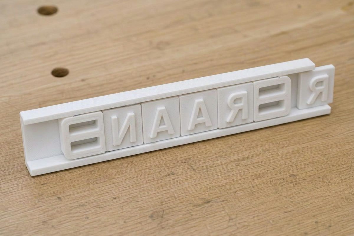
A cookie stamp set with holder is also easier to store, because the rail keeps the working word together between batches. I generate the rail to suit the word: it is sized for the tiles plus a seat at each end for the clamps, with a whisker of slide clearance per tile so nothing binds. If the word is longer than the print bed, the set comes out in two rails and you press twice.
Choosing a font — and why it matters for printing
Fonts are where most letter stamp sets go wrong, and it is not a taste problem. It is a stroke width problem.
Your printer draws lines with a nozzle, usually 0.4mm across. A raised letter stroke needs to be at least a couple of those lines wide to come out solid and stay attached — call it 0.8mm as a sensible floor. Block and rounded fonts have thick, even strokes, so at any tile size they clear that floor easily. They press cleanly, they release from dough without smearing, and they survive being knocked about.
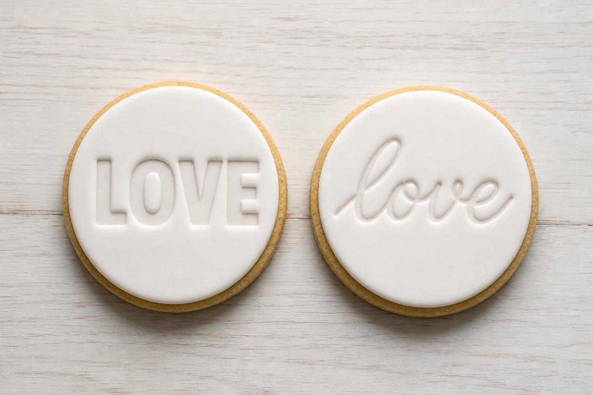
Script and cursive fonts are the beautiful ones and the hard ones. A calligraphic face is built from thick downstrokes and hairline upstrokes, and on a small tile those hairlines can land thinner than the nozzle can draw. What happens then is either a gappy, weak stroke, or the slicer fattens it and the letter loses the contrast that made it look like calligraphy.
Two things fix it. Print the script bigger, so the hairline scales up past the nozzle: 22mm tiles and up. And use a finer detail setting, so the thin strokes get held closer to their true width instead of being bulked out. That is why my script tiles default to a bigger tile and a finer floor than my block tiles — the geometry has to earn the letterform.
Serifs sit in between. A classic serif at 18mm is usually fine; the same serif shrunk to a stamp for tiny biscuits will lose its fine bracket first. If in doubt, print one letter with a lot of thin bits — a lowercase e, or a capital A in a script — and look at it before you commit to the whole roster.
What size should letter stamps be?
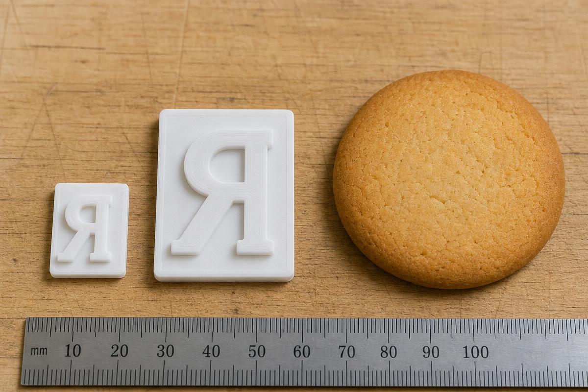
Tile size is the size of the whole tile, not the letter. The letter is scaled to sit inside it with a margin, so a capital comes out at roughly 60-70% of the tile height. An 18mm tile gives you about an 11-12mm capital, which is the sweet spot for a standard round cookie.
| Tile height | Capital letter | Best for |
|---|---|---|
| 15mm | ~9-10mm | Small biscuits, long words, initials on the back |
| 18mm | ~11-12mm | Standard cookies — the default I use most |
| 22mm | ~13-15mm | Script fonts, larger cookies, cupcake toppers |
| 26mm | ~16-18mm | Cake lettering, fondant plaques, single-word statements |
Two practical limits. Long words in big tiles run past the print bed, so a name cookie stamp for a long name is often better at 18mm than 26mm. And the rail grows with the word, so check the total span before you print rather than after.
My rule of thumb: pick the tile size from the surface you are pressing, then check the font can carry it. Cake and fondant get the big tiles. Cookies get 18mm. Scripts get bumped up a size regardless.
One more thing on size: doubles. If you are pressing names, you will hit repeated letters constantly — EMMA, ANNA, LILY. Print two or three spares of the common vowels and of L, N, S and T when you run a set, because that is what stops you re-slicing on a Friday night for one missing letter.
Christmas is when the doubles really catch you — MERRY needs two Rs, CHRISTMAS needs two Ss. If you are printing for Christmas, the free Christmas cookie cutter sets are worth a look too: each one pairs a cutter with a matching stamp so the detail presses in without any piping. Browse free Christmas cookie cutter files.
Printing tips for crisp letters
A 0.4mm nozzle is right for this. It resolves the strokes and it is what everything ships tuned for. A 0.6mm will print these, but the finest script strokes flatten out; a 0.2mm gets you slightly sharper letter edges for a lot more time on the bed.
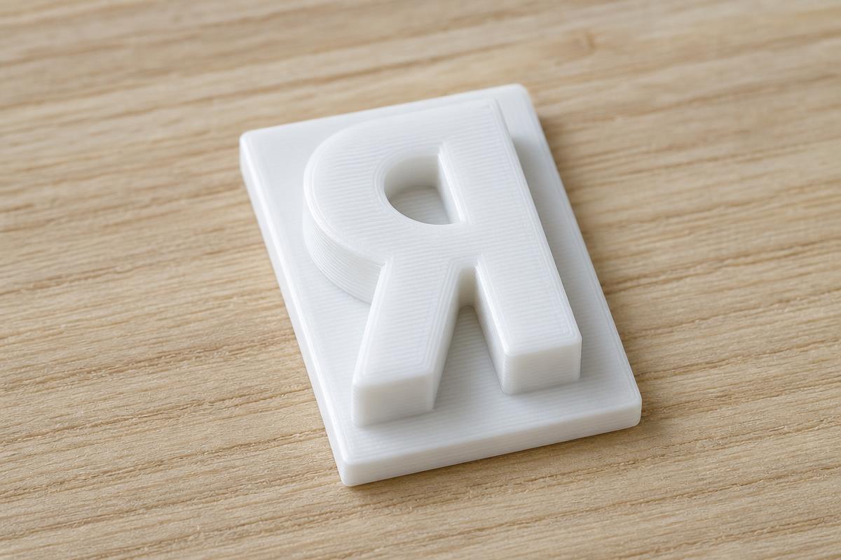
- Use your quality preset — 0.12mm to 0.16mm layers. The letter face is the top surface, and thinner layers show up there more than anywhere else.
- No supports. The tiles are flat-backed and print letter-up, and the rail and clamps are drawn so their overhangs are chamfered rather than sheer.
- Slow the outer wall down a touch. Ringing on a letter's outline is the difference between a crisp impression and a fuzzy one.
- Skip a raft of extra top layers on the letters and instead check the first layer is properly squished — a lifting tile corner ruins the press depth on one side of the word.
- Print one test letter with thin strokes before running 30 tiles. Ten minutes now beats a failed roster later.
- Script tiles are delicate by nature. The hairlines are thin because the font is thin; handle them with that in mind rather than expecting block-font toughness.
For dough, a light dusting of flour or cornflour on the letter face stops it sticking and keeps the edges sharp. On fondant, press firmly and lift straight up — a wiggle on the way out is what smears an impression.
Hand wash before first use. Hand wash only — no dishwasher.
Generate your own alphabet stamp set in any font
This is what BakeShape does. Type the letters you want, pick a font, pick a tile size, and it generates the tile STLs for you — plus the holder rail sized to your word and the two spring clamps. Numbers and symbols are in the roster too, so you can do 21st, dates, ampersands and question marks, not just A to Z.
It works with Google Fonts, so a custom cookie stamp any font request is usually just a matter of choosing it from the list — block, rounded, serif, slab, or one of the scripts with the bigger-tile and finer-detail defaults already applied. One font is free to use. All the fonts are included with Club.
The sizing and detail defaults described above are baked in, so a script set arrives on bigger tiles with a finer floor without you having to know that beforehand. You can still override any of it — tile height, letter weight, ridge depth — if you have a preference from your own bench.
Everything comes out as watertight STLs, ready to slice. If you want the whole 3D printed alphabet stamps set in one go, hit the full roster button and let it build.
Questions I get asked
Can I make a cookie stamp with my own font?
Yes, as long as the font is available as a Google Font — BakeShape traces the letterforms from the font itself, so the tiles match the typeface you chose. Very thin display or hairline faces are the only ones that give trouble, and those need a bigger tile to print properly.
How do I make alphabet cookies?
Roll and cut your cookies, then press a letter tile into the raw dough before baking, or press into a fondant plaque and lay that on a baked cookie. Load the tiles into the holder rail in word order so the whole name presses level in one go.
What size nozzle for letter stamps?
A 0.4mm nozzle with a quality preset is the right default and handles every font size in this guide. A 0.6mm will print block fonts fine but softens fine script strokes, and a 0.2mm buys a little extra sharpness for a lot more print time.
How big should cookie stamp letters be?
For standard cookies, 18mm tiles give a capital letter around 11-12mm, which reads well without crowding the cookie. Go to 22-26mm for cake lettering, fondant plaques and any script font, since capitals land at roughly 60-70% of the tile height.